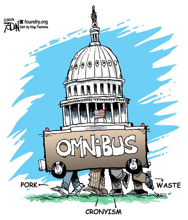
This week another Uniparty Omnibus spending bill was passed without much a fuss. I was thinking Speaker Johnson was going to be a force to stand up to the machine and reduce spending. I thought he was going change things. I may have been mistaken. 😞 We need to get inflation under control, its like a brush fire that could consume the country. Meanwhile the money printing machine is in overdrive. Instead of whining about it on X, why not do something that’ll bring some visibility and comprehensibility to these massive bills?
Many years back, I’ve registered a domain politipal.com, which I had grandiose plans for. Naturally, I’ve done nothing with it. It’s time to change that too.
If you haven’t seen one before, these bills are published in the most unusable format possible. A super lengthy document, that no one can easily read and/or understand. Example 👇🏻
No way to compare to previous years, no way to visualize using common graph paradigms. Hopefully, this project will fix that.
How does a project like this make money? I have not f’ing clue, but I’m tired of doing nothing and watching the shit show carry on uninterrupted.
The first step is a POC. Can I parse this bill text into usable data with readily available open source scripts, programs, etc?
Automated Workflow:
- Read and parse the document, extracting sections.
- For each section, extract relevant details.
- Format those details into a JSON object.
- Insert the JSON object into Database.